STEP 1: FILE SETUP + SKETCH
FILE SETUP: In Photoshop, click File-New. In the window that pops up, ensure your document is set to at least 300dpi and set to CMYK color mode for print or RGB for digital display. (You can always convert between the two later.) If you are doing an 8" square book for example, set the width to 16.5" by 8.5." This allows for the whole spread to be visible in one document and also adds .25" bleed on all sides. (You can always trim off but you can't add more after printing!) I like to draw red guides along the paper edges where the bleed starts, and a line through the middle to represent the gutter, where the pages are glued into the spine. Make sure no important illustration elements or text falls into the gutter!
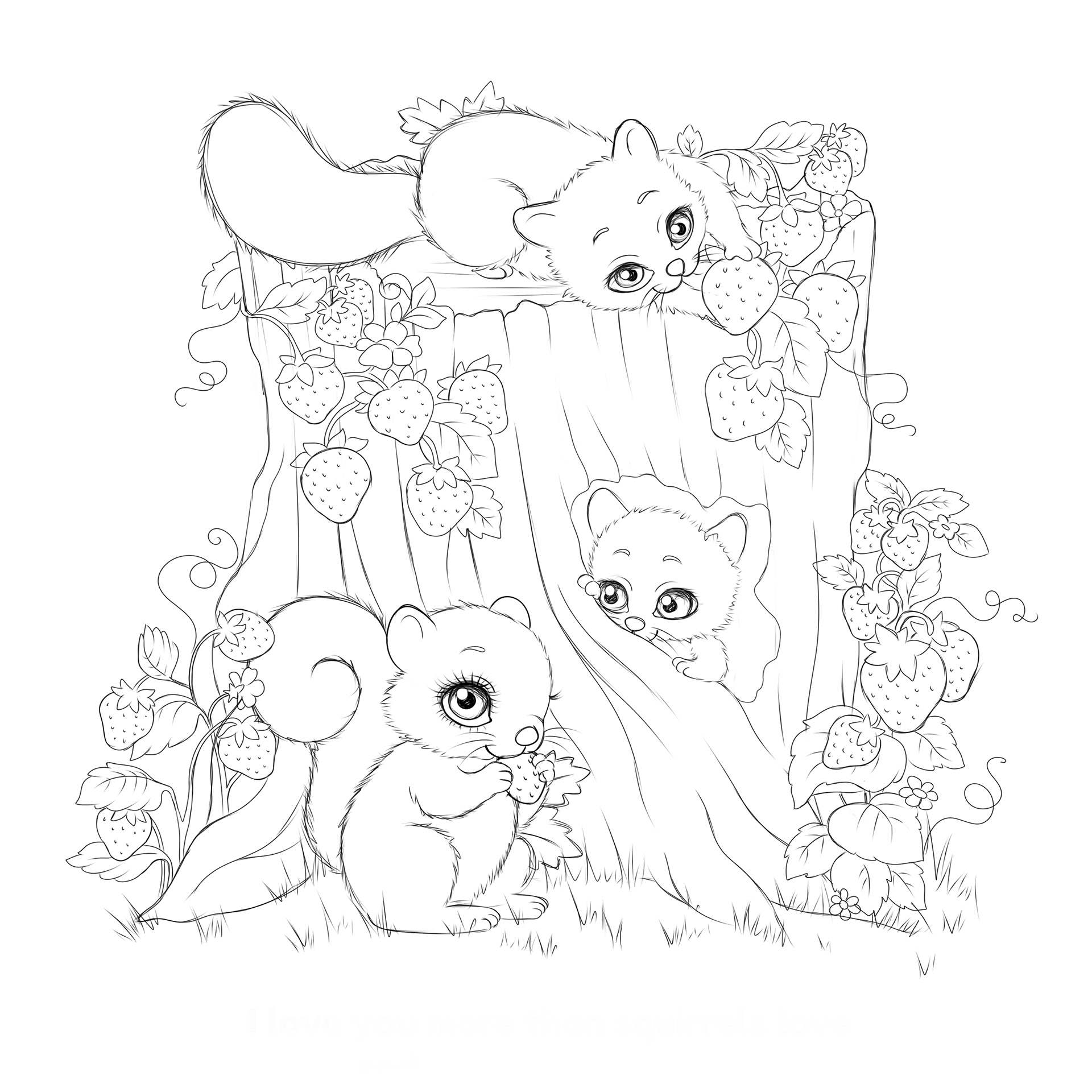
SKETCH: Before color, I prefer to flesh out a sketch to act at the framework. It keeps my workflow more organized moving forward. Create a new layer and label this one "sketch." In any illustration, the sketch is always most important-it lays the entire foundation for the rest of the illustration! Take your time drawing and brainstorming the composition on this layer, and work from loose, general shapes, and eventually hone your linework down to a clear sketch image. Here I used a 3 pixel black calligraphy brush. When you have something that you feel clearly represents what you want your illustration to look like, you're ready to dive into color! Note that not everything has to be fleshed out in sketch. Things like clouds, or other small details can be represented directly with color-no need to sketch every little thing! At this point we want to ensure the author/client can see your sketch and understand what the image will look like when colored. It's a lot easier to get their color approval when they can clearly see what your sketch plan is for the illustration! It's your job to visually communicate, so try to be as clear as possible in service of your author.
STEP 2: COLOR BLOCKING
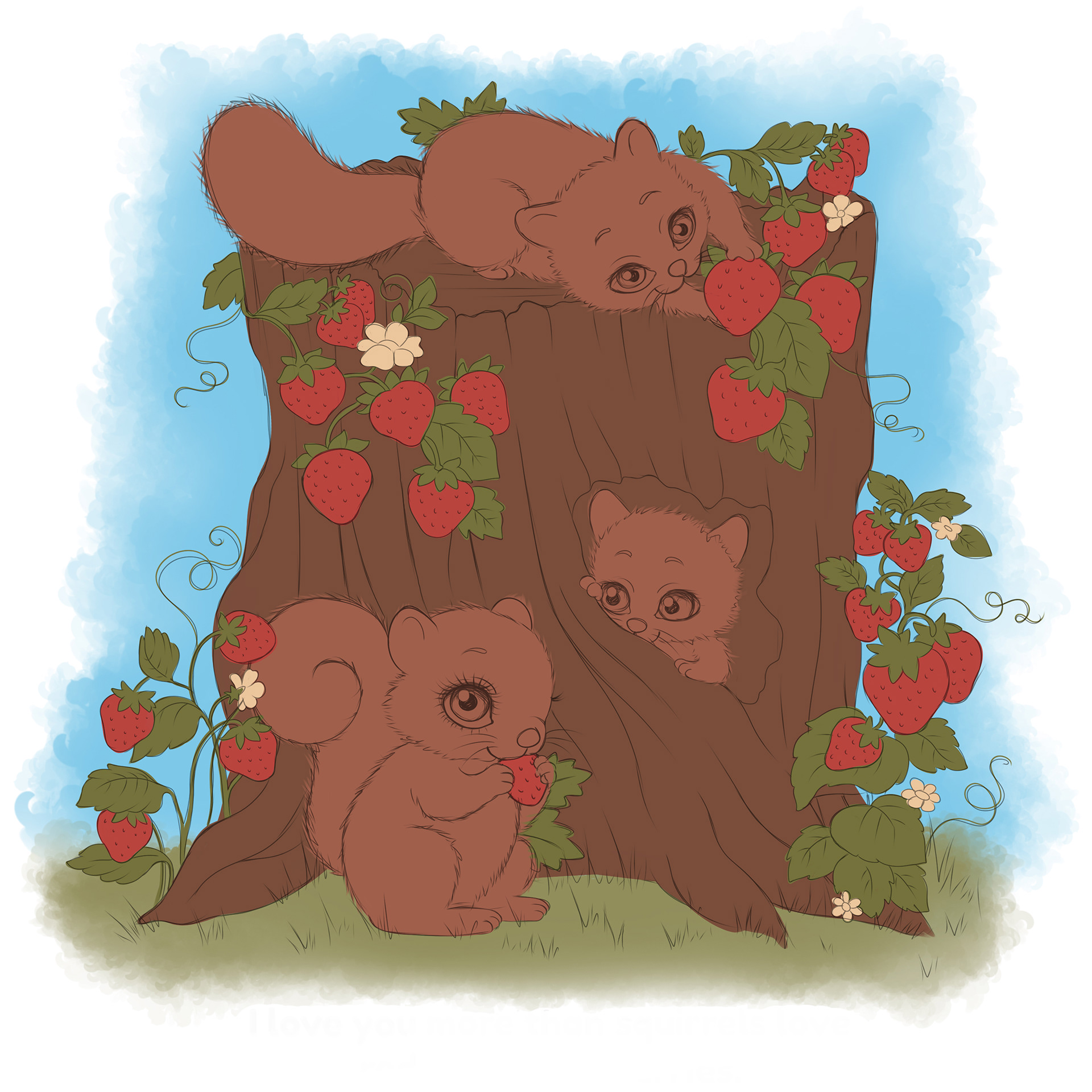
Once you’ve secured client approval on the sketch, you can dive into color blocking! Set your sketch layer to around 40% opacity-enough to still be able to see it, but not too dark or overpowering. (You don’t have to do 40%-just whatever your preference is!) Create a new layer and position it BELOW the sketch layer. We want the sketch layer to stay on TOP of all other layers. So in this new layer below the sketch, paint your sky with a flat, medium value. By medium we mean the middle value of the entire object. This means that later on we will be using colors both darker and lighter, and that this color falls somewhere in the middle. The “medium” color is a good foundation to work with since it’s in between your darkest darks and lightest lights. Create a new layer and paint the ground with a medium value and repeat the same process with all other objects. Each layer should represent a new object or object group. In my case, I had a layer for the squirrels, a layer for the tree stump, a layer for the strawberries, etc. At this stage, it’s all solid colors using a soft brush in the background, and a hard brush for the objects in front. Just lay out your flat colors according to your sketch guide, and then you’ll be ready for shading in the next step. A challenge we face in this particular illustration is that the squirrels and tree stump are both brown, so we will have to shift the hues and bump up the contrast later on to ensure the finished artwork is easily readable. Each illustration will pose its own challenges. Thankfully we can always adjust hues and values to improve our image at any time.
STEP 3: ADD LIGHT + DARK VALUES
In this method of illustration I'm showing you today, clipping masks are your friend. Clipping masks adhere ONLY to the pixel information of the layer it is clipped to, and nothing outside of it. Create a new layer and alt + click on one of your layers to clip this layer to one of your flat color layers. Now, on the clipping mask, you can take a round fluffy brush set to a lower opacity and build up some lighter and darker value strokes without painting outside of the solid shapes you laid out in step two. Each flat color layer will need its own clipping mask layer. Clipping masks keep your painting workflow clean and organized, and prevents color from ending up in places you don't want it to. Choose a darker color for your areas you'd like in shadow, and a lighter color for areas that you imagine would be catching light. (See how starting from a medium tone helped?) At this point I feel comfortable disabling the visibility of the sketch layer, since my eye can see some of the basic forms, shadows and highlights I will be building upon later. There's still a bit more work to do, but now we can start to see the direction this illustration is going in and I can take it from here without needing the help of the sketch guide created in step one.
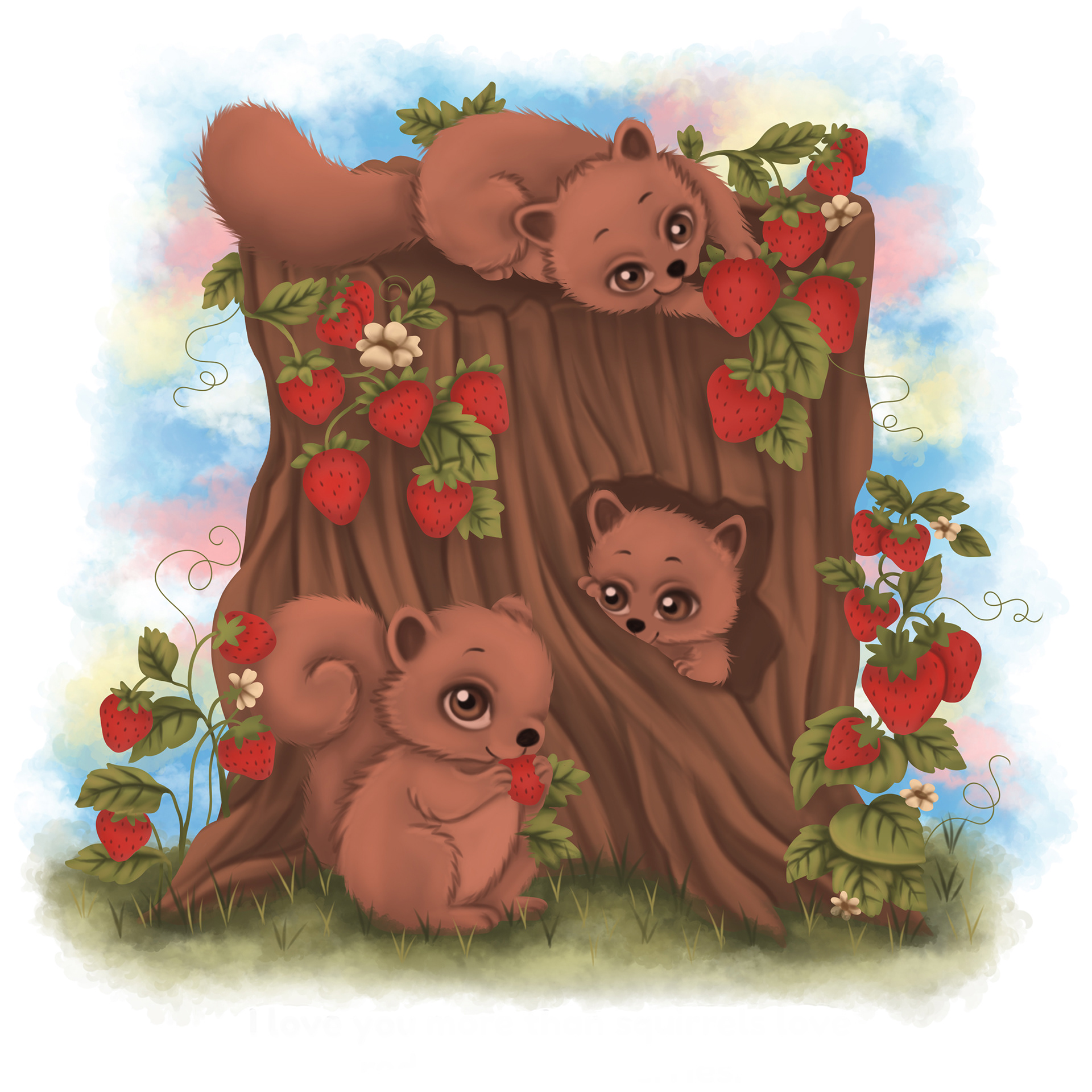
STEP 4: DETAIL FORMATION
We've laid enough of the groundwork in steps two and three to better understand the forms we are working with. Now we can build up the visual quality of the illustration and pay more attention to the smaller details within the shapes. See how we started with large, flat color masses earlier and now we are able to focus on the smaller details? Here I started adding the strawberry seeds, shadows on the leaves, more tree bark definition, iris highlights, etc. We still have a bunch of hard, unnatural-looking edges that we will be addressing later on. For now, this step is all about adding more color information to the illustration. Keep building!
STEP 5: EDGES + SATURATION
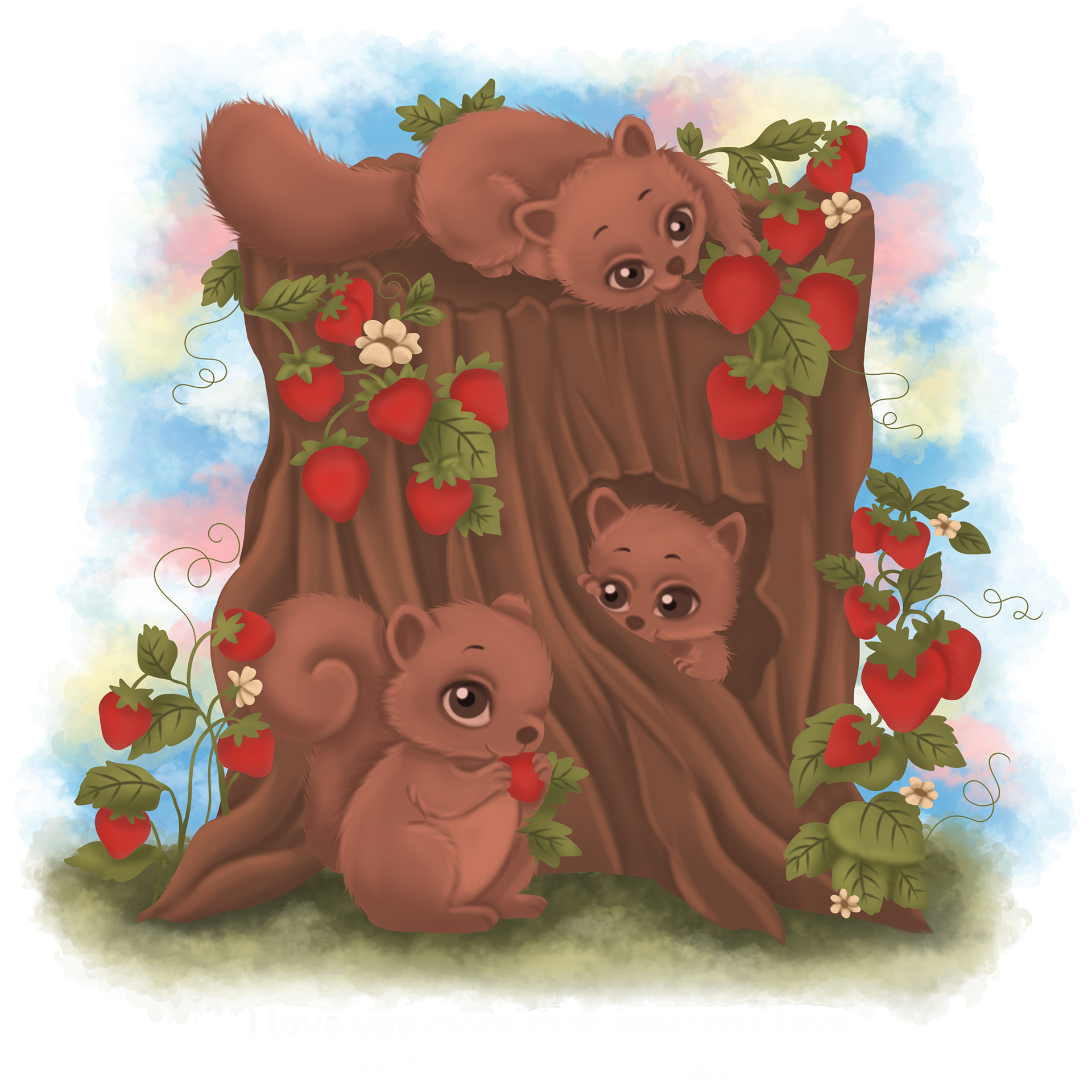
Now let's deal with our edges and saturation levels. At this point, create new layers separate from your clipping masks to soften some of your edges. I used one layer to add some dark red-brown strokes around the strawberry edges, another for the shadows over top of the squirrels' feet and bellies, and another for some added some texture below the tree stump. Think of this as the blending stage, where we are unifying the colors and shapes together so we don't have objects that feel out of place. This is also the point where we can introduce more saturated colors to our image. Brighter, peachy colors on the squirrels, yellows on the leaves, etc. Children really enjoy bright, happy colors and fun details-so let's play to that!
STEP 6: FLATTEN + FINALIZE
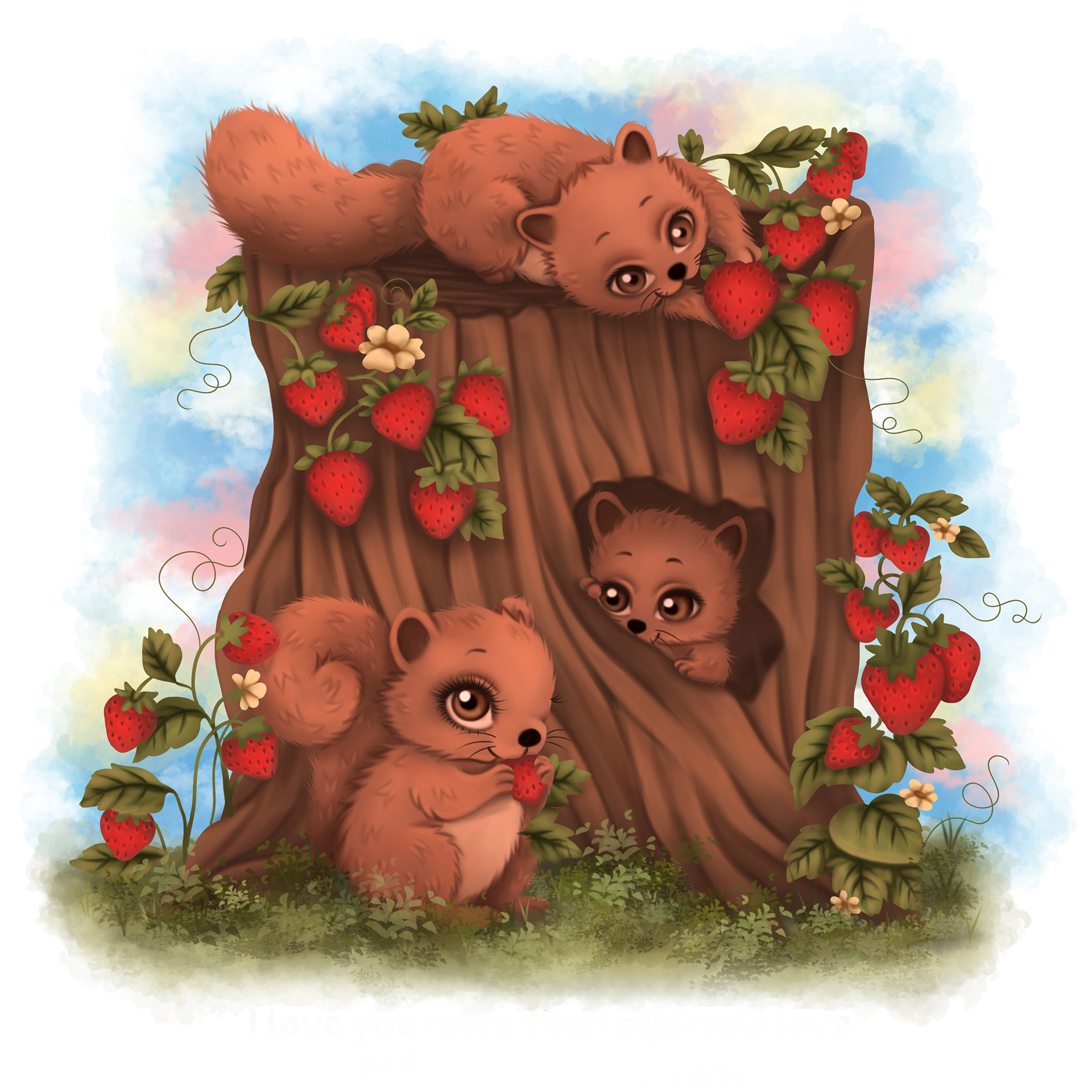
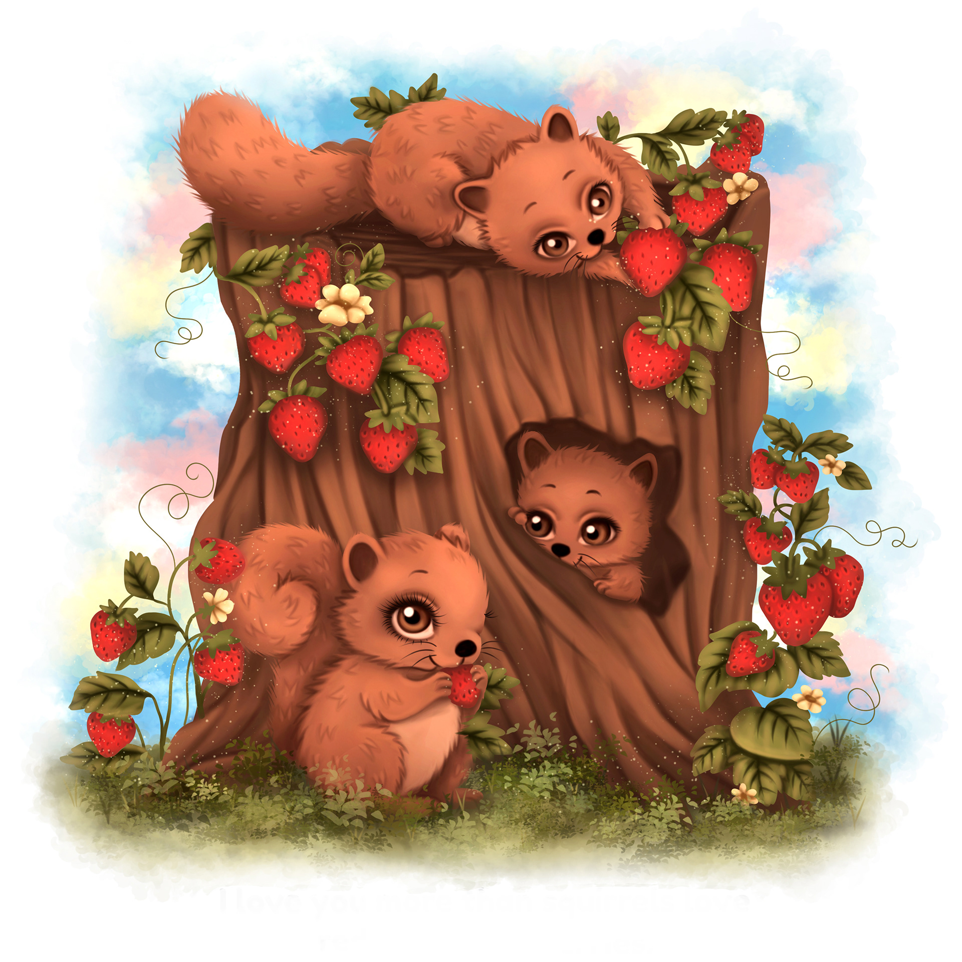
Almost there! Compile all layers together into a flat image. (But remember to save backups of all your layers into a folder labeled "backup" just in case you or your author want to make revisions to individual parts later!) Now we can adjust the image as one unit and bump up the contrast by pulling the light and dark levels a little closer together: image->adjustments->levels. I have also used the color dodge and color burn tools to amplify existing highlights and shadows. Try to keep color dodge and burn brush opacities very low. It's easy to go overboard with these powerful tools! Most of the work should be done with the brush tool, only using these enhancement features at the end to polish up your work. In this tutorial we've used only a couple simple brushes that already come with the software and maintained an organized workflow from sketch to fully-rendered illustration. When you proof the final colored image with your client, make sure you are submitting an RGB proof to ensure colors are as accurate as possible from your screen to theirs. Happy coloring!
Thanks for reading! I hope this was informative and added value to your children’s book illustration experience. Please use the “Contact” form on my website if you have any questions or comments- I’m always happy to talk illustration with you guys!
Peace and love, Julie